
Clickable Prototype Design Link: Click here
Kent Building Supplies, a prominent home improvement retailer in Atlantic Canada, sought to enhance their e-commerce platform, kent.ca, focusing on the cart and checkout processes. The existing website, over a decade old, was not user-friendly, lacked responsiveness, and contained insufficient information, leading to a high cart abandonment rate of 76.19% year-to-date.

As the Lead UI/UX Designer, I spearheaded the initiative to revamp the cart and checkout experience. My responsibilities encompassed conducting comprehensive research, analyzing user behavior, developing user personas, and collaborating with cross-functional teams to ideate, prototype, and implement design solutions aimed at reducing cart abandonment and enhancing user satisfaction.
Revamping to a new website was one of the main hurdles because the previous database was not particularly user-friendly. The website was a decade old, not responsive, and lacked necessary information as well as being difficult to use.
- Conducted a heuristic evaluation of the current cart process to identify usability issues and pain points.
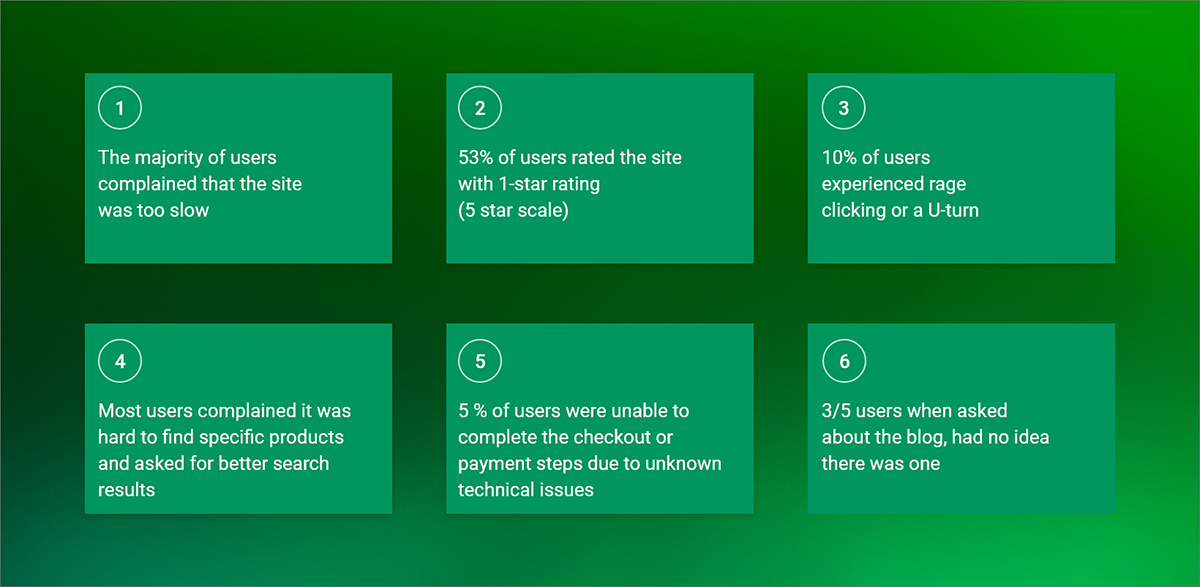
- Analyzed user feedback and complaints about the cart and checkout process through customer support tickets, reviews, and social media channels.
- Reviewed industry best practices and benchmarks to understand the current standards and trends in e-commerce cart design.
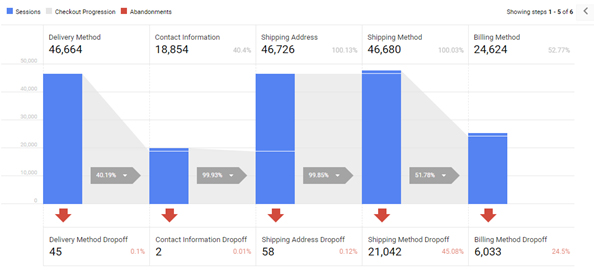
Currently, the Cart Abandonment rate is 76.19% YTD. While some of this percentage can be attributed to customers researching products online, this analysis shows how many customers abandoned checkout at different steps.
- Shipping Method 45%: (Mobile 52.45%, Tablet 46.65%, and Desktop 37.25%)
- Billing Method 24.5%: (Desktop 35.19%, Mobile 10.97%, and Tablet 9.68%)
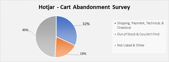
According to Hotjar data, 1420 customers responded to the Cart Abandonment Survey and there are 44% approx. customers drop off without completing the survey.
- Shipping, Payment, Technical, and Checkout – 32%
- Out of Stock and Couldn’t find – 19%
- Not Listed or Other – 49%
- Conducted user interviews with a diverse group of kent.ca customers to understand their shopping behaviours, preferences, and pain points related to the cart process.
- Distributed surveys to a larger sample of kent.ca customers to gather quantitative data on their satisfaction with the current cart experience.
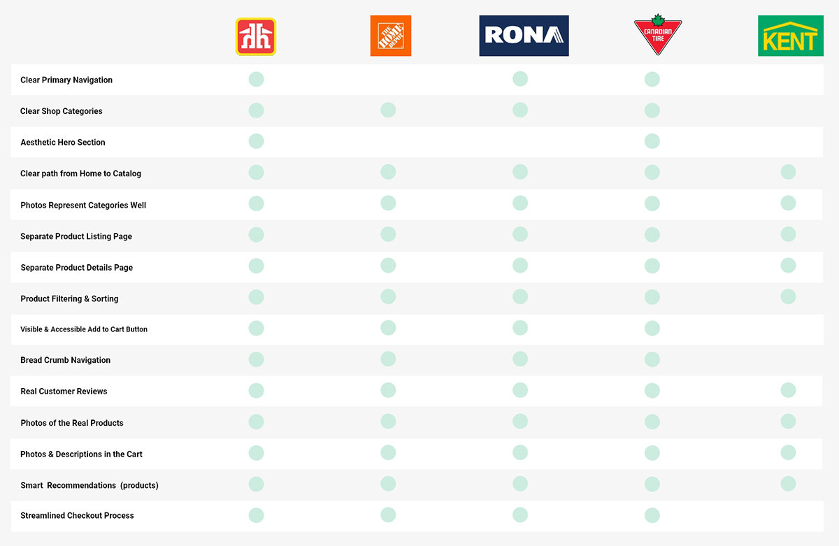
Analyzed the cart processes of competitors in the home improvement industry and other leading e-commerce websites to identify innovative features and best practices that could be applied to kent.ca.
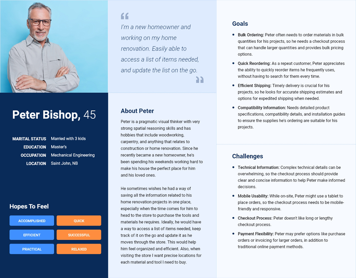
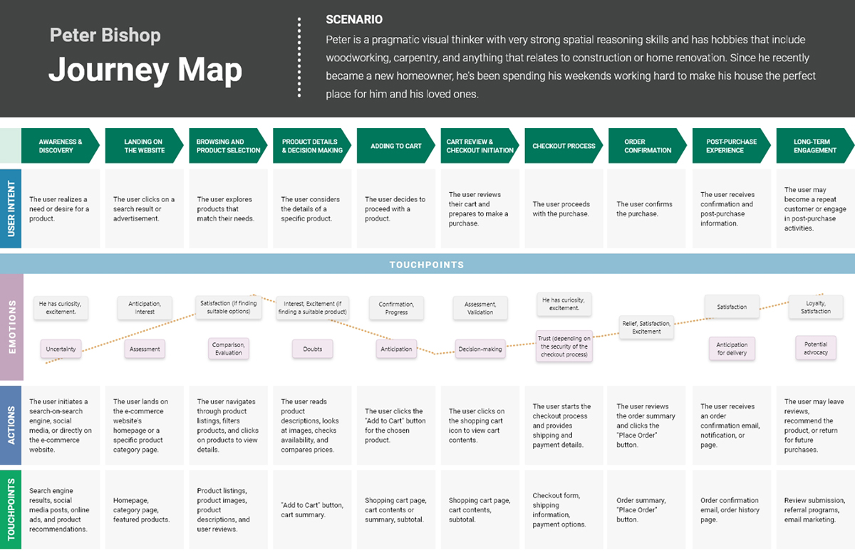
Based on research insights, we developed user personas to represent key customer segments. These personas guided our design decisions, ensuring that the solutions addressed the specific needs and goals of our diverse user base.
Collaborated with the design and development teams to brainstorm and ideate potential solutions to address the identified pain points and improve the overall cart and checkout experience.
Created wireframes and prototypes of the redesigned cart step based on the insights gathered from the research and analysis, incorporating the best practices and innovative features identified in the competitive analysis.
- Save For Later' functionality
- Product recommendation
- Replicating subtotals at top and bottom (especially for mobile)
- Options to print or email the cart
- Promo code integration
- Enhancements: Continue shopping links to last viewed page and remove breadcrumbs
- Clear icons for 'Buy Online, Pick Up In-Store' (BOPIS) and shipping options
- Free shipping indicators and estimated delivery dates
- Ability to change pick-up store
- Options for protection plans and additional services for appliances
- Enhancements: 'Remove' call-to-action positioned near quantity selection
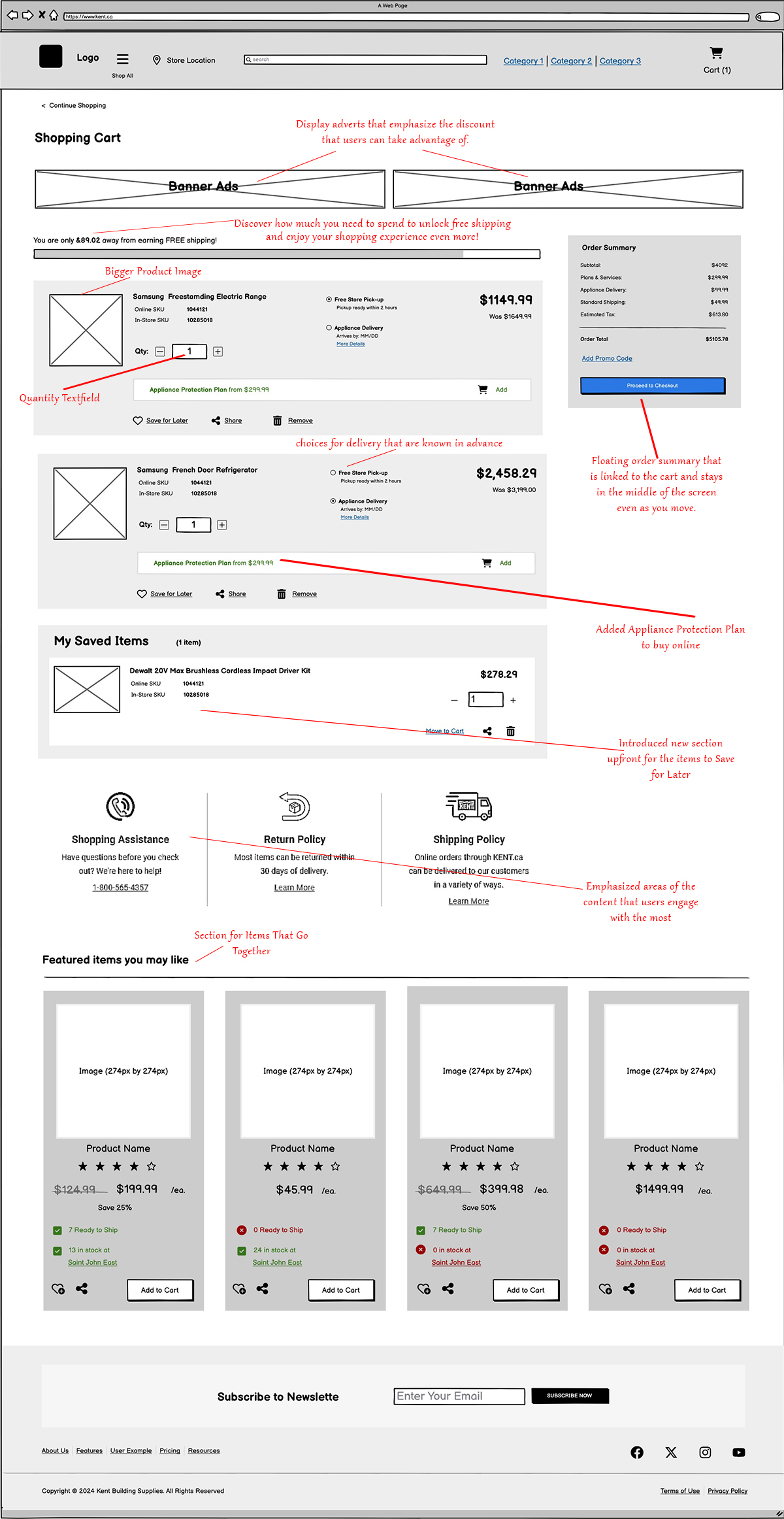
During the review of the prototype, the business stakeholders (UX Strategists and Product Managers) decided to go in a different direction. After some brainstorming and discussion, we came to a conclusion that it would make more sense to have each product in the cart grouped by the delivery method, with proper headings. This, in turn, would increase the scannability of the cart for the user, allowing them to make updates to individual products in the cart with clarity and ease.
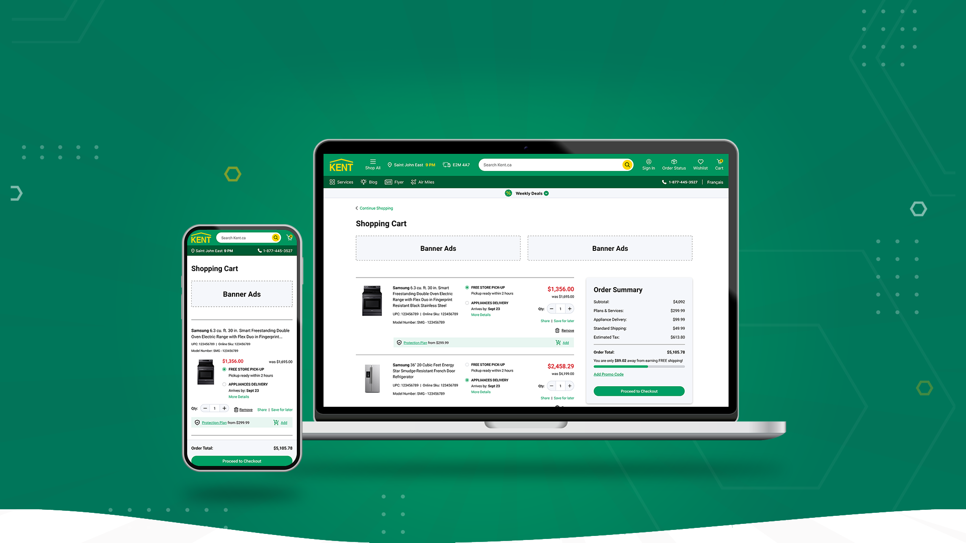
We started with mobile-first designs to accommodate the majority of Kent's user demographic. We also wanted to ensure our designs were responsive. We decided to integrate all the potential shipping and delivery scenarios (I.e. scheduled Delivery, standard shipping, same-day courier, etc.), relevant promotions, and feedback messages in one single mock-up so that it would be easier for the business analysts to write user stories/use cases for the development team.
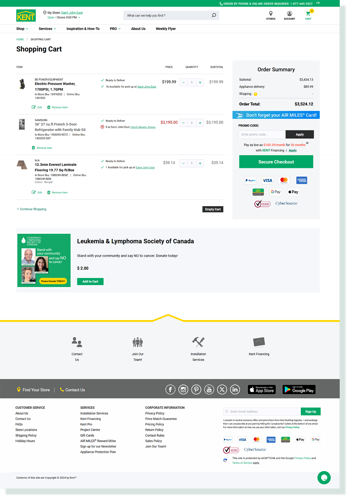
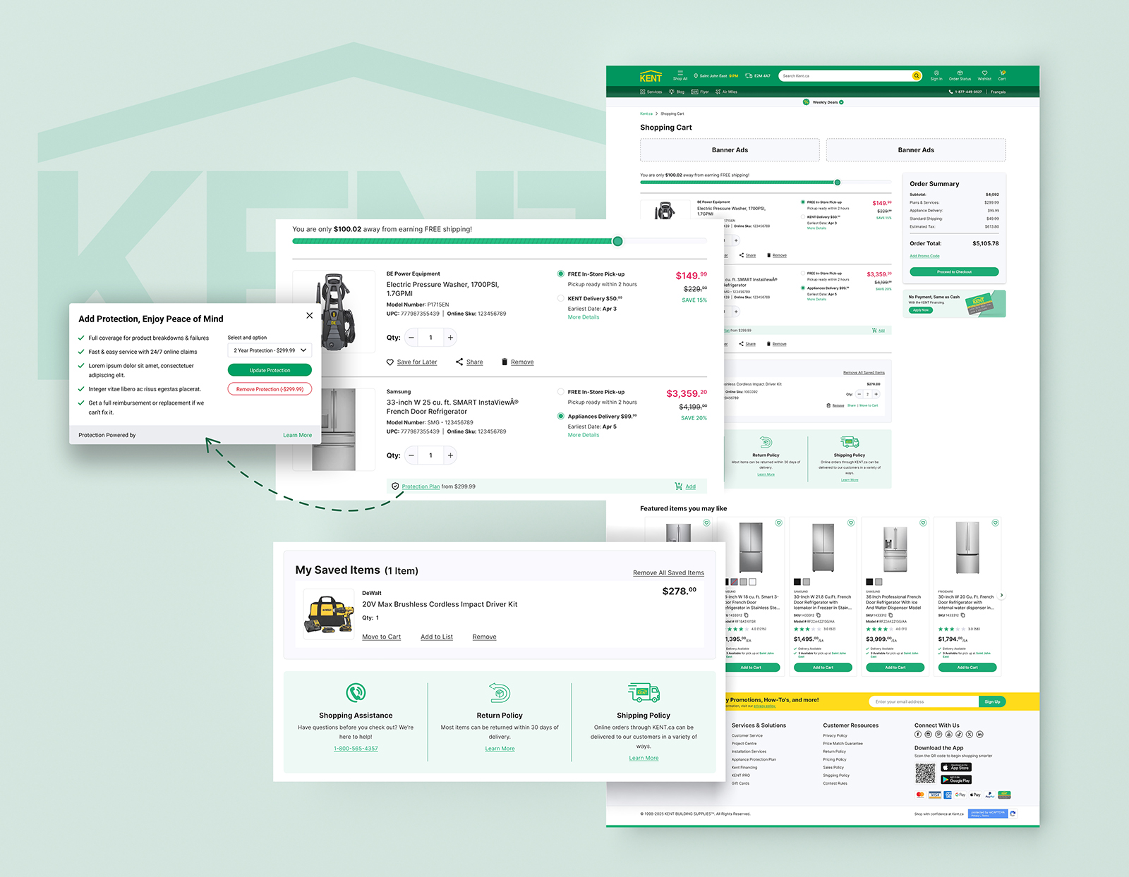
The biggest challenge I faced was actually designing the UI for cart for the tablet and desktop, especially when it came down to the appliance product and whether a promotion had been applied. Each product had its respective description, quantity, fulfillment options, quantity increment tool and subtotal, with the appliance having a distinct Parts & Services section as well. Spacing was a huge problem especially when a promotion was applied as more content needs to be presented.
This was all solved with the use of different typographic treatments with large typefaces for important type elements such as subtotal, product name, main fulfillment option and smaller. I used white space between elements to create distinctions between each of them to ensure proper readability.
The sticky cart summary tends to be cut off in its initial placement, which was right beside the delivery method card, when viewed at 1024x768 (one of the common resolutions used by our customers according to analytics). The Live Chat graphic was also getting cut off halfway, leading to a bad overall experience.
I simply shifted the sticky cart summary to align with the "Proceed to Checkout" button and migrated the Live Chat banner graphic to an actual standalone banner right below the last delivery method, resulting in a great experience.
The redesign of the cart step on kent.ca was a collaborative effort that involved thorough research and analysis, user interviews, competitive analysis, persona development, ideation and prototyping, usability testing, and implementation with A/B testing. The insights gathered from the research and testing process were instrumental in creating a more user-friendly and efficient cart experience for kent.ca customers.
- A streamlined, easy-to-follow checkout process with clear steps
- Clear and concise messaging to avoid any confusion about product inventory, or shipping and delivery options
- Enhanced marketing opportunity for the business to promote sales offers, financing options, and extended warranty plans
- An order summary breakdown that includes all extra fees (sales tax + any shipping fees) so that the price to pay is crystal clear to the customer
Some valuable ideas we came up with were unfortunately not in scope for this project due to time resource constraints, but were deemed worth of future features to deploy or fast follows for development after go-live.
- Frequently bought together recommendations
- Voice-to-text search capability
- Global drop-down banner slider for additional promotion banners
“I had the pleasure of working with Munish at KENT and was consistently aware of his creativity, precision, and user-first mindset. He played a key role in elevating our digital presence by refining design systems and delivering seamless, intuitive experiences. One of his standout contributions was leading the redesign of Kent’s B2C and B2B websites. His user-centric approach balanced aesthetics with functionality, resulting in a modern, scalable design that improved usability across platforms. Munish brings a deep understanding of UX/UI, a sharp eye for detail, and a collaborative spirit. He’s proactive, receptive to feedback, and always pushing for better design. Any team would be lucky to have him!”
Nisha Viswanathan
|Executive Director - Excellence NB Association Inc.